You log into Google Analytics.
Traffic’s steady. A few pages are even ranking on the first page.
But your inbox? Quiet.
- No booking notifications.
- No inquiry forms.
- No calls.
And you’re left wondering if this whole SEO thing was just smoke and mirrors.
Here’s the good news: the problem probably isn’t your traffic – it’s what happens once people land on your site.
The truth is, most websites aren’t broken. They just have friction.
Confusing layouts. Weak calls to action. Generic service pages that don’t reflect what your best-fit clients are actually looking for.
This article will walk you through a series of small, strategic changes – most of which you can implement in less than a day – that can dramatically increase online inquiries. These aren’t theory. They’re field-tested fixes based on hundreds of site audits, real-world A/B tests, and one hard-earned truth:
Conversion isn’t about cleverness. It’s about clarity.
And once your site becomes clear – about what you do, who you serve, and how to take the next step – people act.
Let’s get to it.
1. Your Above-the-Fold Content Is Too Vague (or Too Crowded)
The top section of your homepage or service page – what people see before they scroll – should be your most valuable real estate. But for many healthcare providers and clinics, it’s where clarity goes to die.
Instead of speaking directly to a potential patient’s need, the above-the-fold content is often:
- A stock photo of someone smiling vaguely into the distance
- A headline like “Compassionate Care for the Whole You”
- A buried or bland call to action (CTA) like “Learn More” or “Contact”
Here’s the problem: People don’t scroll when they’re confused. They bounce.
The Fix: One Headline. One Message. One Clear Path.
Above the fold, your site should answer three questions instantly:
- Who is this for?
- What do you help with?
- What’s the next step?
Let’s translate that into real-world structure:
- Headline: “Get Same-Day TMJ Relief from a Specialist in Denver”
- Subheadline: “We help adults in pain regain comfort and sleep without long waits or generic treatments.”
- CTA: “Book a Free 15-Minute Call” (or) “Check Availability Now”
If someone in your target audience lands on this and thinks, “That’s me,” they’re already halfway to conversion.
This section doesn’t need to win design awards. It needs to remove doubt, spark clarity, and create movement.
And it needs to do all that before the visitor even touches their trackpad.
2. Your Forms Are Hidden, Confusing, or Overloaded
You’ve probably heard the phrase “Make it easy for people to contact you.”
But ease isn’t just about availability. It’s about visibility, simplicity, and momentum.
Here’s what happens on most healthcare websites:
- The “Contact” form is buried in a dropdown menu.
- The form itself asks for 12 fields – including information the patient hasn’t even decided to share yet.
- The confirmation page says something vague like “Thanks, we’ll get back to you.”
- There’s no clarity on when that happens – or what happens next.
Every one of those is a conversion killer.
Because the modern patient isn’t just comparing providers. They’re comparing experiences.
If someone else offers a frictionless path to booking, you just became their fallback option.
The Fix: Fewer Fields. Front-and-Center. Emotionally Safe.
Let’s simplify:
- Where to place it: Top right of every page and embedded mid-scroll on service pages
- How many fields: Name, email, phone, and one open-ended “How can we help?” field
- What to call it: “Get in Touch,” “Ask a Question,” or “Request a Call” – avoid “Submit”
- What to promise: Reassurance. “We’ll respond within 1 business day. Your information stays private.”
And if you’re feeling bold? Test it.
- A/B test different CTA headlines.
- Test forms with vs. without the phone number field.
- Track drop-off. Optimize fast.
Because if your form causes even a second of confusion or hesitation, most people won’t fight through it.
They’ll just close the tab – and Google the next name on the list.
3. You’re Not Using Client-Language on Your Service Pages
You might think your copy is “clear.”
You wrote it in complete sentences. You mentioned your specialties. You even listed your credentials.
But here’s the test: Does it sound like something your ideal client would actually say?
Because if your website talks like you… instead of like them… your message is missing the mark.
Let’s break it down.
The Problem: Clinical Language = Emotional Distance
Too many websites lead with:
- “We offer evidence-based, integrative treatment protocols”
- “Our multidisciplinary team delivers high-quality outcomes”
- “Board-certified. Results-driven. Committed to care.”
Those phrases might be technically correct. But they don’t convert, because they don’t connect.
Your visitors don’t search for “integrative modalities.” They search for “knee pain won’t go away,” “can’t sleep after surgery,” or “is my hip replacement failing.”
The gap between how you talk about your work and how your clients describe their pain is where conversions die.
The Fix: Mirror Real Phrases – Not Just Keywords
Pull from these sources to write language that reflects your audience:
- Intake calls – What exact phrases do new patients use to describe their issue?
- Online reviews – What do past clients thank you for? (That’s the copy you want.)
- Search queries – Use tools like Ahrefs or Search Console to find long-tail terms that show real search intent.
Example transformation:
- ❌ – “Offering TMJ treatment with customized splint therapy”
- ✅ – “Can’t sleep because of jaw pain? We help patients in [City] find relief – fast.”
Bottom line: The best service pages don’t just describe what you do. They describe how it feels to need what you offer – and what it’s like to get it.
That’s what builds trust. That’s what moves people to act.
4. You’re Not Capturing Local Intent with Your SEO
You could write the most informative service page in your industry – clean layout, clear CTAs, emotionally resonant copy – and still never show up for local searches.
Why? Because Google isn’t just looking for relevance.
It’s looking for proximity and specificity.
If your site doesn’t clearly signal where you serve, search engines won’t assume it.
And if your pages aren’t optimized for local intent, your competitors (especially the ones who are) will take the top spots.
The Mistake: Broad Copy, Generic SEO, No Geography
Too many sites list their services without anchoring them to a location.
- “We offer sports injury rehab and preventative care.”
- “Specialized dental treatments for long-term health.”
- “Individual and group therapy available.”
All fine statements. But none of them answer the real question patients are asking: “Can I get this near me?”
The Fix: Be Unmistakably Local – In Every Page Element
To capture local intent, your site needs to shout geography in ways that feel organic, not spammy.
Here’s how:
- H1s and Meta Titles
- “Pelvic Floor Therapy in Plano” > “Pelvic Floor Therapy”
- “TMJ Specialist for Austin Professionals” > “TMJ Treatment Services”
- Page Copy
- Mention nearby neighborhoods, landmarks, or cities: “We help patients from Brookline to Back Bay…”
- Add directions or parking notes: “Conveniently located across from Emory Midtown.”
- Embedded Maps & Footer Details
- Use Google Maps embeds with your address tagged
- Include NAPW (Name, Address, Phone, Website) in your global footer
- Localized FAQs
- “Do you offer evening appointments for patients in [City]?”
- “Can I visit from [Nearby Town] if I don’t live in [Main Location]?”
This isn’t about stuffing cities into your content.
It’s about creating geo-confirmation – telling both Google and your visitors, “Yes, we serve people exactly like you, right where you are.”
5. Your Calls to Action Feel Like Dead Ends
What happens when someone clicks your CTA?
Do they land on a page that builds momentum – clarifying their next steps, calming their nerves, and encouraging them to finish the process?
Or do they land in a void?
- A stripped-down contact page with no context
- A scheduling form with no reassurance
- A dead-end “Thank You” page that offers nothing else to do
If your calls to action lead nowhere emotionally – or functionally – then every click is a conversion lost.
The Fix: CTA Pages Should Be Landing Pages, Not Speed Bumps
Your CTAs should open a continuation, not a cliff.
Here’s how to create a CTA path that supports momentum instead of killing it:
1. Clarify What Happens Next
Don’t assume users know what “Schedule Now” means.
Explain it.
- “You’ll pick a time that works for you – we’ll call to confirm.”
- “We’ll get back to you within 1 business day with availability.”
- “Your message goes directly to our care team, not an inbox void.”
This small step removes uncertainty – and increases follow-through.
2. Reinforce the Value
Use your landing page or form intro to reaffirm why taking action matters.
- “Don’t wait another week to get relief from shoulder pain.”
- “The right care plan starts with a 15-minute call. No cost. No pressure.”
- “You’ve done the hard part – now let’s make it easy to get started.”
3. Include Supporting Trust Elements
Even at the last step, people are still asking: Is this legit?
So include:
- Review snippets from similar patients
- A staff photo or practitioner headshot
- Icons for secure form submission, HIPAA compliance, etc.
Because when your CTA feels like a dead end, people hesitate.
When it feels like a guided path, people walk it.
6. No Reviews, No Social Proof, No Trust Anchors
You can have the perfect copy.
You can have the right CTAs.
You can even rank #1 on Google.
But if your site feels like a faceless provider making faceless promises, trust evaporates – and so do your conversions.
People don’t buy based on logic alone. They buy when they feel seen. They book when they feel safe.
The Problem: It’s All You Talking
No testimonials.
No review snippets.
No logos, certifications, or photos of real people.
When your entire website reads like a one-way monologue, visitors are left wondering:
- “Has anyone else used this service?”
- “Do people like me get results here?”
- “Can I trust this person with my time, money, or health?”
If the answer isn’t instantly clear, most won’t ask.
They’ll just move on.
The Fix: Borrow Trust Until You Build Your Own
You don’t need hundreds of 5-star reviews. You need 3–5 pieces of authentic, specific, and strategically placed proof that others have gotten what your visitors are hoping for.
What to Add (and Where):
- Homepage & Service Pages
- Pull 1–2 powerful quotes:
- “I booked on a whim – and it changed my life.”
- “The first place that actually listened.”
- Pull 1–2 powerful quotes:
- Contact Page & CTAs
- Use review stars or mini-badges from Google, Healthgrades, or Zocdoc
- Footer or Sidebar
- Drop “as seen in” or “trusted by” logos – even local orgs or networks work
- Thank You Page
- Reinforce trust again with:
- “You’re in good hands – join the 1,200+ patients who’ve booked with us this year.”
- Reinforce trust again with:
This isn’t vanity – it’s safety signaling.
When people see others go first, they’re more likely to follow.
Not because they’re lazy, but because they’re human.
7. No Scalable System for Localized Lead Generation (Introducing Mosaic)
You might have a great homepage.
A couple of well-optimized service pages.
Maybe even a blog or two.
But what happens when someone searches:
- “Sports chiropractor near Lincoln Park”
- “Med spa for acne scars in North Austin”
- “TMJ dentist in South Charlotte”?
Unless you’ve built location-specific pages that answer those hyper-targeted queries, you’re not even in the running.
And let’s be honest: Manually writing, designing, and optimizing dozens of local pages sounds extremely time consuming – because it is… without the right system.
The Fix: Use Mosaic to Generate Pages That Scale With Demand
Mosaic is Direction.com’s programmatic SEO engine built to solve one very real problem:
How do we help service providers dominate local search – at scale – without sacrificing quality or compliance?
Here’s what Mosaic does:
- Creates dynamic, SEO-optimized pages for every target market or metro area you serve
- Matches real search queries with service-specific and geo-modified content
- Maintains brand voice, tone, and regulatory alignment – no generic templates or content fluff
- Implements internal linking and metadata automatically, improving site structure and crawlability
Example: Instead of one generic “IV Therapy” page, Mosaic builds:
- “IV Therapy for Athletes in Midtown Atlanta”
- “Hangover IV Treatments in Buckhead”
- “Post-Surgical Recovery IV in Decatur”
Each page is custom and powered by structured logic and localized keyword data.
The result?
- More impressions in long-tail, low-competition local searches
- More clicks from people already looking for what you offer
- More inquiries without writing another line of copy yourself
Mosaic doesn’t just automate SEO. It amplifies your voice across the markets that matter most – without burning out your team or breaking compliance.
8. Your Website Doesn’t Make People Feel Something (So They Don’t Do Anything)
People don’t book consultations because your site has the right schema markup.
They book because something you said hit them in the chest.
Most sites don’t lack information. They lack emotion.
There’s no story. No urgency. No human behind the screen. Just a grid of stock photos, robotic headlines, and impersonal lists of services that might as well have been scraped from ChatGPT.
It’s not enough to be findable. You have to be felt.
The Fix: Evoke Emotion, Then Direct It
Want more inquiries? Then make someone stop mid-scroll and think:
- “That’s me.”
- “They get it.”
- “This might finally help.”
Here’s how:
- Start with empathy, not expertise: “We see you. We’ve helped people just like you.”
- Show the stakes: What happens if they wait? If they settle? If they do nothing?
- Create a call to courage: “Take the first step toward feeling better. You don’t have to do it alone.”
Even the best technical SEO can’t save a site that doesn’t move people. Because humans don’t convert out of logic alone.
They convert when something inside them shifts.
That shift is your job.
Stop Guessing. Start Converting.
You don’t need a new website.
You don’t need to go viral.
You don’t need to “out-market” billion-dollar platforms.
You need clarity.
- Clear messaging that speaks like your clients think.
- Clear design that moves visitors toward the next step.
- Clear SEO signals that align with how people search in your area.
And a clear, scalable system – like Mosaic – to bring it all together.
Most websites fail not because they’re broken, but because they’re unfocused. They try to serve everyone and end up speaking to no one.
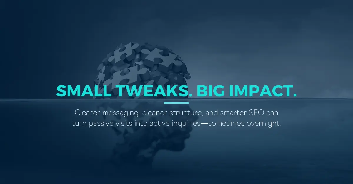
But a few simple fixes – executed with strategy and empathy – can change everything.
Sometimes overnight.
If you’re ready to stop guessing and start converting, let’s talk. We’ll show you what’s holding your site back and what we can fix fast.
Because your clients are already searching.